When Apple first introduced its “Liquid Glass” design with iOS 26, the goal was to give the iPhone a more fluid and visually dynamic look. The glossy, glass-like effects certainly caught people’s attention but not all of the feedback was positive. Many users felt the interface looked a bit too bright and distracting. Now, with the latest developer beta of iOS 26.4, Apple seems to be easing things slightly by adding a new option that lets users tone down some of those visual effects.
The problem: style over readability?
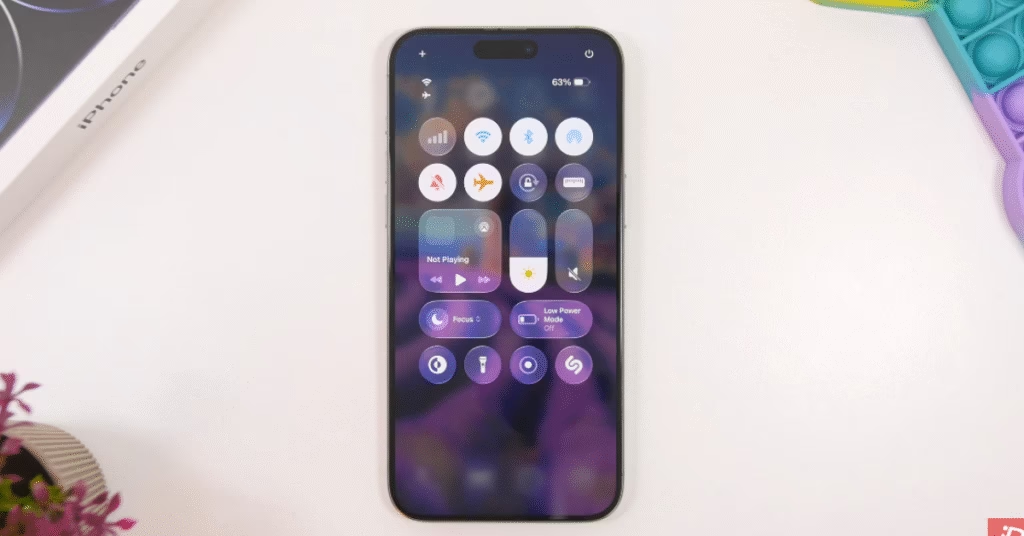
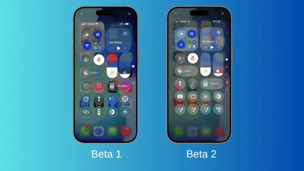
Liquid Glass is Apple’s new visual design language built around translucent layers, glass-like reflections, and animated effects that react to what’s behind them. The idea was to create a more immersive interface across system elements like menus, notifications, and control panels.
In practice, though, many users complained that the design could be overly bright and visually busy. Heavy transparency sometimes made text harder to read, especially when backgrounds were complex or colorful. For others, the constant motion and light effects felt distracting or even uncomfortable.
It quickly became one of the more controversial design choices Apple has introduced in years.
Apple’s solution
In the latest beta update, Apple has introduced a new accessibility option called “Reduce Bright Effects.” The toggle sits inside the system’s Accessibility settings and does exactly what the name suggests: it tones down some of the brighter and more intense visual animations tied to Liquid Glass.
While it doesn’t completely remove the design language, it reduces flashing and high-intensity effects that some users found overwhelming. It’s a subtle change, but one that suggests Apple is paying close attention to user feedback.
This isn’t the first adjustment
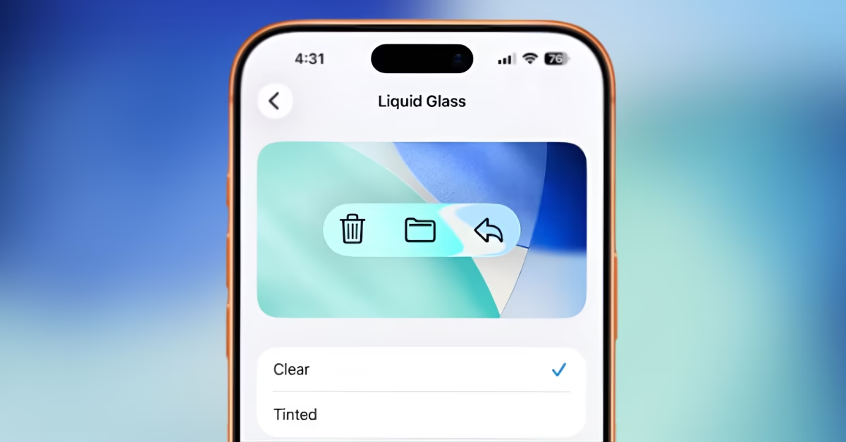
Interestingly, this isn’t Apple’s first attempt to soften the Liquid Glass look. Earlier updates to iOS already introduced options to reduce transparency or apply more opaque “tinted” visuals in parts of the interface.
The addition of another control indicates that Apple is gradually refining the design rather than abandoning it entirely.
Why it matters
Interface changes can be surprisingly divisive. Apple has historically pushed bold UI shifts from skeuomorphic icons in early iOS versions to the flat design overhaul in iOS 7. Liquid Glass is simply the latest step in that evolution.
But modern smartphones are used by billions of people, and accessibility concerns matter more than ever. Features like “Reduce Bright Effects” allow Apple to maintain its design vision while still giving users control over how intense the visuals feel.
With the public release of iOS 26.4 expected in the coming weeks, Apple will likely continue tweaking the Liquid Glass experience based on developer and user feedback.
For now, the message seems clear: the futuristic glass-like interface is here to stay but at least users will soon have more ways to dial it back if the shine gets a little too bright.
Discover more from Phoonomo
Subscribe to get the latest posts sent to your email.