
If you’ve noticed Google’s visual identity getting softer, rounder, and more colorful lately that’s intentional. The gradient aesthetic that arrived with the updated “G” logo, spread to Gemini, and quietly made its way into Maps and Photos is now coming for the apps you use every single day. Google is preparing a comprehensive redesign of Gmail and the entire Google Workspace suite, replacing years of flat, rigid iconography with a flowing gradient design language built for the AI era.
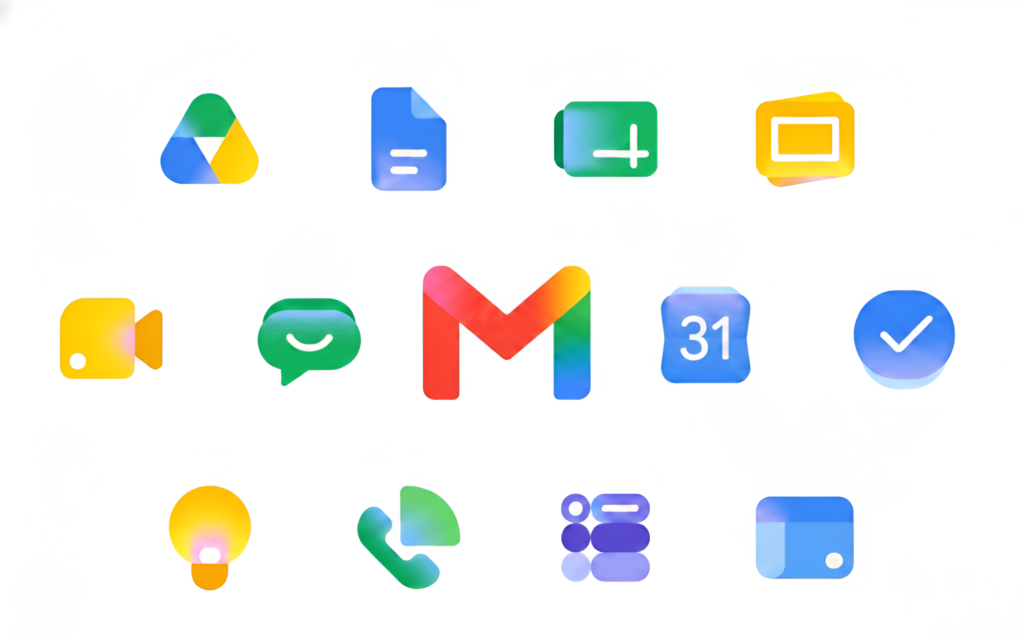
The scope is significant. Gmail, Calendar, Drive, Docs, Sheets, Slides, Meet, Chat, Keep, Forms, and Sites are all in line for the visual overhaul according to 9to5Google, this is a full ecosystem refresh, not a handful of isolated icon tweaks. The new design brings smooth color transitions, rounded shapes, and more visually distinct app identities that are easier to differentiate at a glance. Sheets, Slides, and Forms are reportedly moving away from the classic “document sheet” metaphors toward wider, more abstract layouts.
The reasoning is transparent. Google is standardizing its visual identity around AI and gradient design has become its signal for that. Every Gemini surface already carries this language. Bringing Workspace into alignment makes the whole ecosystem feel coherent rather than patchy.
Early reactions are largely positive, though the Google Keep redesign has already drawn complaints which, honestly, is a tradition at this point. Icon changes on the internet are practically a constitutional crisis every time.
No official rollout date yet, but expect these updates through app updates across Android, iOS, and the web within weeks.
Discover more from Phoonomo
Subscribe to get the latest posts sent to your email.