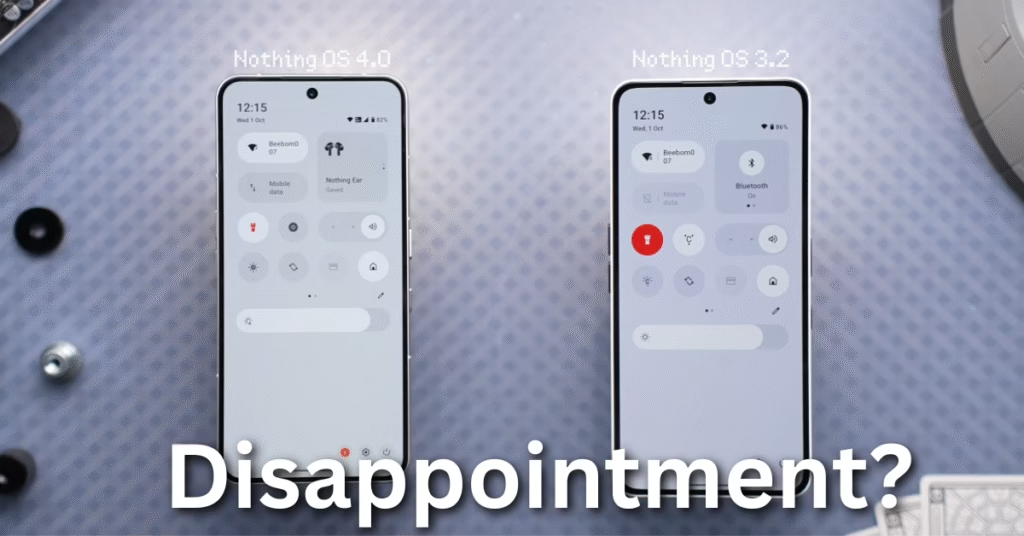
When I first updated my phone to Nothing OS 4.0, I honestly couldn’t tell if anything had changed. Visually, it looked almost identical to the last version. My teammate didn’t even believe me when I said it was the latest updateI actually had to open the About page to prove it. On the surface, the update feels minimal. But after using it for a week, I realized there are some subtle improvements and a few interesting concepts tucked away.
This isn’t one of those updates that screams for attention. Instead, it quietly refines animations, dark mode, and essential features while introducing a brand-new idea called Essential Apps. Let me walk you through my real-world experience of the past week.
Smoother Animations
The first thing I noticed was how apps open and close. The animations feel smoother and slightly more refined. It’s a baby step forward, but it makes day-to-day usage more enjoyable. Compared to before, transitions look cleaner, and I found myself appreciating the small polish even though it’s not groundbreaking. In 2025, most mobile OS developers are obsessed with animation fluidity, and nothing is clearly keeping up with that trend.
Extra Dark Mode
The old dark mode on Nothing phones always felt a bit gray, like it couldn’t decide whether it wanted to commit to true black. With this update, the new “Extra Dark Mode” finally gives us the proper pitch-black background many of us wanted. It’s easier on the eyes at night, saves battery on OLED displays, and simply looks better. I’ve been using it exclusively since the update, and honestly, I can’t go back to the old version.
Pop-up View Improvements
Pop-up apps were already handy, but now you can keep two pop-up windows open at the same time. Switching between them feels natural, and hiding or restoring them with a quick gesture makes multitasking much faster. Over the past week, I’ve used it frequently when I needed to chat while keeping a YouTube video or notes open. It’s a small change, but one that actually fits into daily use.
Quick Settings Tweaks
Quick settings didn’t see a huge redesign, but there are thoughtful little touches. For example, you can now set any toggle to a 2×2 layout, which was previously limited to Bluetooth. This means more customization and better accessibility, especially for people who prefer larger icons.
There’s also a new text notification whenever you toggle something, so you don’t need to guess whether it worked. The Wi-Fi icon even includes a share button, saving you a couple of extra taps when sharing your connection. The brightness slider feels smoother too. These aren’t headline features, but when you use them daily, the differences add up.
Reducing Red
One odd thing I noticed: Nothing has cut down on red color across the system. The torch icon isn’t fully red anymore, the delete icon has been moved to the left and toned down as well. It’s a small design choice, but noticeable if you’ve been using older versions. Maybe it’s intentional, maybe it’s just a style shift, but I personally found the stronger red more striking.
App Changes
The Recorder app has been redesigned. Earlier, it had this vinyl-inspired UI that you could interact with like a DJ, which felt fun and unique. Now, it’s cleaner and more traditional. While it looks fine, I personally think the old design had more character. On the plus side, there’s a new feature where the recording light on the back of the phone indicates when you’re recording, though it didn’t work reliably during my testing.
Lockscreen Updates
Two new clock styles have been added, both inspired by clean, minimal fonts. They look modern and refreshing, and I found myself switching between them throughout the week. The transition between lockscreen and always-on display is smoother now to more flickering or blinking. It’s the kind of detail you only notice after living with the update.
Essential Apps: A Big Idea
The most exciting part of this update is Essential Apps. It’s an experimental concept where anyone can create simple apps through prompts and share them publicly. Right now, they’re mostly widgets rather than full apps, but the idea is promising.
In my first week, I came across custom creations like water intake reminders, step counters, calculators, dice rollers, even simple games like Flappy Bird and 2048. It reminded me of Nothing’s earlier push for shareability with EQ profiles and widgets. This could become a big deal if they expand it to full app functionality in the future.
Settings & AI Usage
The Settings app now puts a big visual of your device at the top of the About page, which looks nice but takes up space. There’s also an app optimization toggle that supposedly helps apps launch faster. In practice, I didn’t notice a huge difference, but maybe it’s doing its work quietly in the background.
Another addition is an AI usage page, showing how often AI features are being used. There’s also a small indicator in the status bar whenever AI is active. It’s transparent and reassuring, but currently, there’s no way to manage or control it.
Missing Features
While there are thoughtful refinements, the update still feels light compared to what rivals like OxygenOS and OriginOS are rolling out. There are missing features people have been asking for better haptic feedback, more native apps, redesigned camera UI, and promised gallery improvements that still haven’t shown up. After using Nothing OS 4.0 for a week, I can say it’s not a bad update, but it doesn’t feel ambitious enough either.
Final Thoughts After a Week
After living with this update for seven days, my opinion is mixed. On one hand, Nothing OS 4.0 refines the user experience with smoother animations, better dark mode, and a handful of quick setting tweaks. On the other, it removes some of the quirky charm (like the vinyl recorder app) and doesn’t push bold new features except for Essential Apps, which are still limited.
If you’re already on a Nothing phone, the update is worth installing. You’ll appreciate the smoother experience, even if it doesn’t wow you. But if you were expecting a groundbreaking new OS version, this isn’t it. It’s steady, it’s usable, and it shows potential for the future, but right now, it feels more like a safe step than a leap.
See Also Nothing Raises $200M to Take on Apple and Samsung
FAQs
What is new in Nothing OS 4.0?
Nothing OS 4.0 adds smoother animations, an extra dark mode, minor quick settings tweaks, redesigned recorder app, and new lock screen clock faces. The most unique addition is “Essential Apps,” which let users create and share simple widgets.
Does Nothing OS 4.0 bring major visual changes?
Not really. At first glance, it looks almost identical to the previous version. Most of the updates are hidden or subtle, so casual users may not even notice a difference.
How is the performance of Nothing OS 4.0 compared to older versions?
The OS feels slightly smoother with app opening and closing animations, and there’s also an optimization feature for faster app launches. Day-to-day performance is stable, but not drastically different.
What is the ‘Essential Apps’ feature in Nothing OS 4.0?
It’s a new feature that allows users to build simple widgets like reminders, calculators, and even mini-games. These can be shared with others, though full app creation isn’t available yet.
Is Nothing OS 4.0 worth upgrading to?
If you like smoother animations, better dark mode, and the idea of creating widgets through Essential Apps, then yes. But if you’re expecting a major redesign or loads of new features, it may feel underwhelming.
Discover more from Phoonomo
Subscribe to get the latest posts sent to your email.